Two suggestions for the style library - one general, one specific.
General - it would be nice if the page re-arranged to fit the display. If you run at something other than normal zoom settings in your browser, there is a bunch of wasted space you can’t get rid of. I would love to have that space be usable.
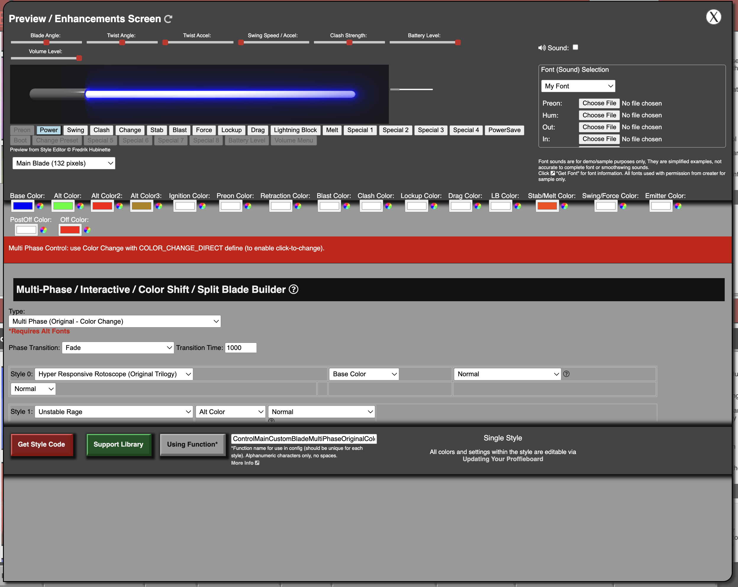
Specific - in the blade builder, it would be nice to be able to only have an option for one style. Currently the minimum is two.
That is all - minor stuff for what has become a crucial tool.
The blade builder is built to “combine” more than one base style, if you only need one style then use that style from it’s main location. There’s nothing to “combine” if it’s just a single base style.
The page is designed to adjust to screensize within reason. There’s a limit to max width otherwise it becomes unruly to try and lay out and keep things aligned. There’s also dedicated room on the right side for the help “?” screen when needed.
It would take a considerable amount of time to redesign so it’s not in the cards for the foreseeable future.
It’s not that it should be wider, it’s just that there’s dead space at the bottom where it could have the scrollable area larger. Obviously there’s stuff to show because that scrolled section isn’t exactly short…
I think that’s what they’re talking about, fwiw.
OK, that’s because the overall height is a % but the objects within have set heights, so if you have a really large screen it will create some extra space, but on a smaller screen if those objects didn’t have the fixed heights they’d be illegible. Ultimately, I design for the smallest screen size to make sure things work, if you have something much larger then I suppose it looks like there’s more room but it’s not so straight forward to fix and I simply don’t have the time to look into every possible screen size.
That was what I was talking about, yes.