Project Glyphy: a visualizer & validator tool for ProffieOS TEXT font files

If, like me, you’ve ever wondered what all the characters in your ProffieOS text fonts actually look like, then Glyphy is the tool for you.

GitHub: GitHub - olivierflying747-8/Glyphy · GitHub

This is what Glyphy can do. Example output:
Aurebesh10Font_03

StarJedi10Font_02

StarJedi10Font_04

saber_logo_01

StarJedi10Font_05

But that is not all:

  • Output formats: .bmp / .png / .jpg
  • Diagnostic overlay
  • Detect issues (incorrect uintXX_t, missing bitmap arrays / GLYPHDATA, etc.)
  • Display duplicates and commented “ghost” glyphs
  • Create OLED-friendly sized text-based .bmp

If you want to design your own text font, Glyphy can help you:

  • Validate and repair it
  • Generate a skeleton font (bare structure ready to be “artified”)
  • Fix structural issues automatically

Important:

  • Glyphy does not generate glyph art
  • Glyphy never modifies your original file (repairs are written to a clone)

It should work on Windows, macOS, and Linux (tested on Windows only). Python is required.

This started as a personal tool to inspect a single font. It quickly got out of hand.

4 Likes

If you find a “compile-error” bug, I will need a few things to reproduce it:

  • copy of the error message
  • copy of the # USER SETTINGS all the way down to # END OF USER SETTINGS
  • name / copy / link of the .h text font used

I tested and re-tested as much as I could think of but the more I added to it, the less likely I tested every single combination of modes and bools possible.

I didn’t test anything macOS or Linux related because I only have Windows.
The OS specific features are:

  • AUTO_OPEN renders and reports: AUTO_OPEN_IMAGE = True & AUTO_OPEN_REPORT = True
  • find system TTF for labels & legend
  • CLI menu based single key inputs from the repair tool: OPEN_REPAIR_MENU = True. If no errors are found in your font, repair menu will not prompt to open. If you want to see it, just change one uint16_t to uint17_t.

I made Glyphy very resilient to render “malformed” bitmap arrays. Glyphy can render:

0b0101UL, <-- standard format, duh
0b0101, <-- missing 'UL'
0101UL, <-- missing '0b'
0101, <-- missing '0b' & 'UL'
0101 , <-- missing '0b', 'UL' & extra space

What Glyphy can’t render (it used to, but I had to make it a bit stricter because the results were ugly → everything was placed on one column):

0b0101UL  <-- no comma ','
0b1010UL 

As long as there are binaries separated by commas “,” Glyphy can render them.

I’ll appreciate any feedback or suggestion. Thank you for trying Glyphy.

MTFBWY

1 Like

I created two more tools to help edit Glyphs:

asciify.py will create asciified.txt:
from

0b000000000000000000UL,
0b000001111111100000UL,
0b000110100010111000UL,
0b001101111111101100UL,
0b011011111111110110UL,
0b010011001100110010UL,
0b110111101101111011UL,
0b111111100001111111UL,
0b101101100001101101UL,
0b111100000000001111UL,
0b101111100001111101UL,
0b100111100001111011UL,
0b010111001100111010UL,
0b010011001110110010UL,
0b001011111111110100UL,
0b000101111111101000UL,
0b000011000001110000UL,
0b000000111111000000UL

to

LLLLLLLLLLLLLLLLLL
UUUUUUUUUUUUUUUUUU
      ██████
    ████ █ ███
   ██  ████   █
  ██  ███████  █
  █ ████  █████ █
 ████████ ███████
 █ ██ ███ ██  ████
 ████        ███ █
 █ ████     ████ █
 █ ████     ████ █
 █ ██         ██ █
 ████ ███ ██  ██ █
 █ ██████ ███████
  █ ████  █████ █
  ██  ███████  █
   ██  ████   █
    ████ █  ██
      ██████
bbbbbbbbbbbbbbbbbb
000000000000000000

The glyph can be edited to, for example:

LLLLLLLLLLLLLLLLL
UUUUUUUUUUUUUUUUU
     ███████
   ███  █  ███
  ██   ███   ██
 ██   █████   ██
 █  ████ ████  █
████████ ████████
█ ██ ██   ██ ██ █
█ ███       ███ █
█ ████     ████ █
█ ████     ████ █
█ ███       ███ █
█ ██ ██   ██ ██ █
████████ ████████
 █  ████ ████  █
 ██   █████   ██
  ██   ███   ██
   ███  █  ███
     ███████
bbbbbbbbbbbbbbbbb
00000000000000000

I am no artist, but IMHO, the second one looks a lot less like a squashed bug and more like an imperial logo.
use deasciify.py to read asciified.txt and create deascified.txt:

0b000001111111100000UL,
0b000111000000111000UL,
0b001101111111101100UL,
0b011001111111100110UL,
0b010011011110110010UL,
0b110011101101110011UL,
0b100111100001111001UL,
0b101111000000111101UL,
0b111100000000001111UL,
0b101111000000111101UL,
0b100111100001111001UL,
0b110011101101110011UL,
0b010011011110110010UL,
0b011001111111100110UL,
0b001101111111101100UL,
0b000111000000111000UL,
0b000001111111100000UL

  uint32_t

  Glyph height: 22
  Glyph width: 17

added bonus, deasciify.py will also calculate the size of the new glyph to help update GLYPHDATA, if needed.

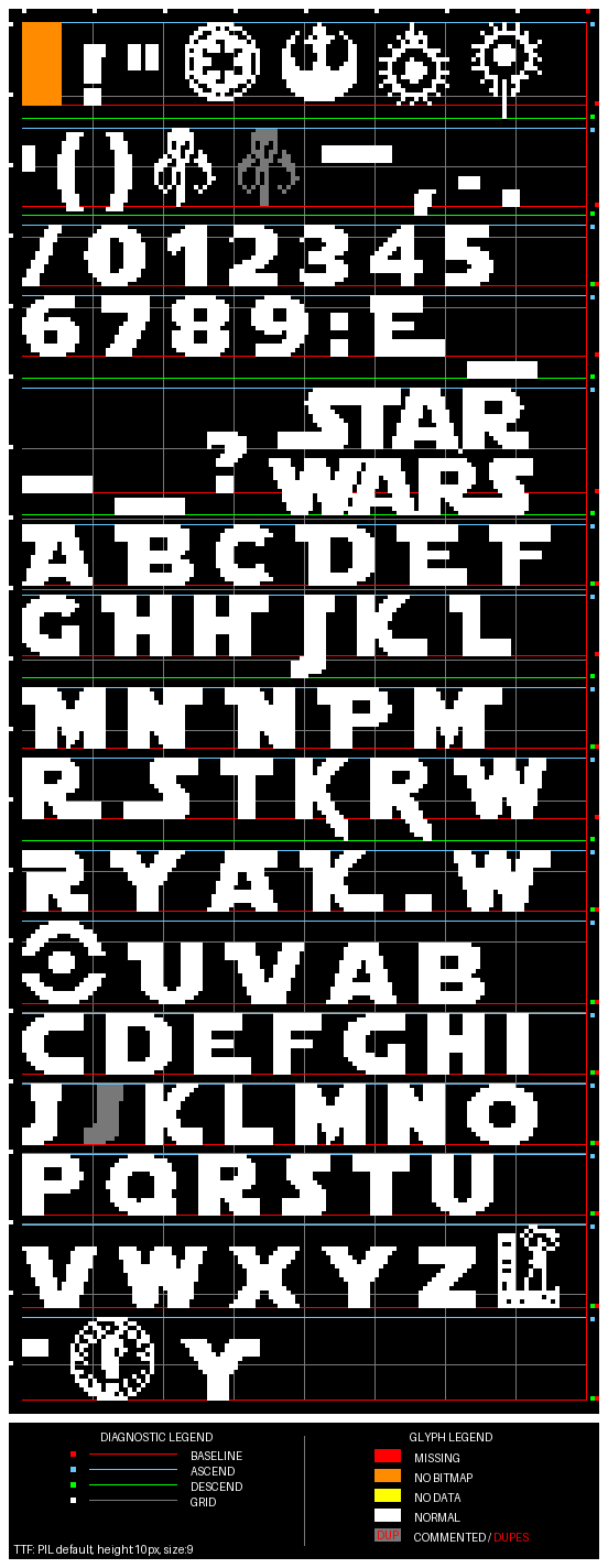
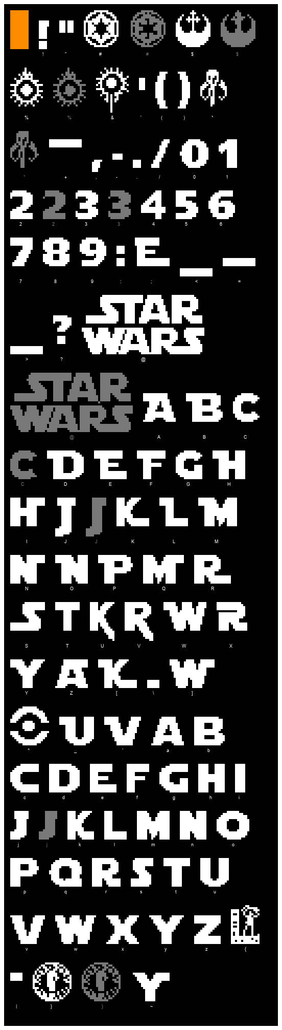
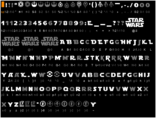
And this is a before/after comparaison of some of the StarJedi10Font.h characters that I edited on my ProffieOS (the white ones are new, the grey ones are the old ones that I left as commented glyphs):

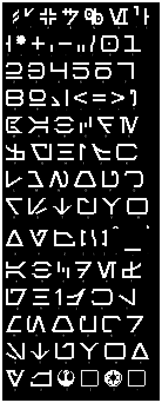
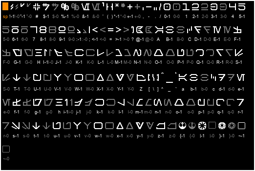
I did the same to Aurebesh10Font.h:
Aurebesh10Font_14
The “|” & “~” characters seem to be place holders (I am thinking to try and make republic & Sith symbols)

@profezzorn: are you interested in any of these changes to be added to master OS? I didn’t change the sizes of any glyphs, as to not “break” any configs.

In StarJedi10Font.h 38 characters have an advance width narrower than their glyph width making them slightly overlap with the next glyph. Is that on purpose ? The “<” (char28) draws an underscore that underlines the previous character, so I believe that one is on purpose.

This is an edited version of a Glyphy font analysis report:

==============================================================
================ GLYPHY FONT ANALYSIS REPORT: ================
==============================================================

Font name: StarJedi10Font.h

==================== GLYPHY FONT DETAILS: ====================

char11 - '+':
  [INFO] advance width (14) smaller than bitmap width (16)
    line: 1589
    suggestion: replace '{14, -1, -13}' with '{16, -1, -13}'

char15 - '/':
  [INFO] advance width (7) smaller than bitmap width (9)
    line: 1593
    suggestion: replace '{7, -1, -13}' with '{9, -1, -13}'

char27 - ';':
  [INFO] advance width (13) smaller than bitmap width (17)
    line: 1605
    suggestion: replace '{13, 0, -13}' with '{17, 0, -13}'

char29 - '=':
  [INFO] advance width (14) smaller than bitmap width (16)
    line: 1607
    suggestion: replace '{14, -1, -3}' with '{16, -1, -3}'

char32 - '@':
  [INFO] advance width (52) smaller than bitmap width (60)
    line: 1610
    suggestion: replace '{52, -9, -23}' with '{60, -9, -23}'

char33 - 'A':
  [INFO] advance width (14) smaller than bitmap width (16)
    line: 1611
    suggestion: replace '{14, -1, -13}' with '{16, -1, -13}'

char34 - 'B':
  [INFO] advance width (16) smaller than bitmap width (18)
    line: 1612
    suggestion: replace '{16, -3, -13}' with '{18, -3, -13}'

char36 - 'D':
  [INFO] advance width (16) smaller than bitmap width (18)
    line: 1614
    suggestion: replace '{16, -3, -13}' with '{18, -3, -13}'

char37 - 'E':
  [INFO] advance width (13) smaller than bitmap width (16)
    line: 1615
    suggestion: replace '{13, -2, -13}' with '{16, -2, -13}'

char38 - 'F':
  [INFO] advance width (13) smaller than bitmap width (14)
    line: 1616
    suggestion: replace '{13, -2, -13}' with '{14, -2, -13}'

char40 - 'H':
  [INFO] advance width (14) smaller than bitmap width (16)
    line: 1618
    suggestion: replace '{14, -3, -13}' with '{16, -3, -13}'

char41 - 'I':
  [INFO] advance width (14) smaller than bitmap width (17)
    line: 1619
    suggestion: replace '{14, 0, -13}' with '{17, 0, -13}'

char42 - 'J':
  [INFO] advance width (9) smaller than bitmap width (10)
    line: 1620
    suggestion: replace '{9, 0, -13}' with '{10, 0, -13}'

char43 - 'K':
  [INFO] advance width (13) smaller than bitmap width (16)
    line: 1621
    suggestion: replace '{13, 1, -13}' with '{16, 1, -13}'

char44 - 'L':
  [INFO] advance width (13) smaller than bitmap width (14)
    line: 1622
    suggestion: replace '{13, -2, -13}' with '{14, -2, -13}'

char45 - 'M':
  [INFO] advance width (17) smaller than bitmap width (19)
    line: 1623
    suggestion: replace '{17, -3, -13}' with '{19, -3, -13}'

char46 - 'N':
  [INFO] advance width (15) smaller than bitmap width (17)
    line: 1624
    suggestion: replace '{15, 1, -13}' with '{17, 1, -13}'

char47 - 'O':
  [INFO] advance width (15) smaller than bitmap width (16)
    line: 1625
    suggestion: replace '{15, -2, -13}' with '{16, -2, -13}'

char48 - 'P':
  [INFO] advance width (14) smaller than bitmap width (17)
    line: 1626
    suggestion: replace '{14, -2, -13}' with '{17, -2, -13}'

char49 - 'Q':
  [INFO] advance width (17) smaller than bitmap width (20)
    line: 1627
    suggestion: replace '{17, 0, -13}' with '{20, 0, -13}'

char50 - 'R':
  [INFO] advance width (15) smaller than bitmap width (18)
    line: 1628
    suggestion: replace '{15, 1, -13}' with '{18, 1, -13}'

char51 - 'S':
  [INFO] advance width (11) smaller than bitmap width (17)
    line: 1629
    suggestion: replace '{11, -5, -13}' with '{17, -5, -13}'

char52 - 'T':
  [INFO] advance width (10) smaller than bitmap width (12)
    line: 1630
    suggestion: replace '{10, -1, -13}' with '{12, -1, -13}'

char55 - 'W':
  [INFO] advance width (17) smaller than bitmap width (21)
    line: 1633
    suggestion: replace '{17, -2, -13}' with '{21, -2, -13}'

char57 - 'Y':
  [INFO] advance width (14) smaller than bitmap width (17)
    line: 1635
    suggestion: replace '{14, -1, -13}' with '{17, -1, -13}'

char58 - 'Z':
  [INFO] advance width (14) smaller than bitmap width (16)
    line: 1636
    suggestion: replace '{14, -1, -13}' with '{16, -1, -13}'

char59 - '[':
  [INFO] advance width (13) smaller than bitmap width (19)
    line: 1637
    suggestion: replace '{13, -2, -13}' with '{19, -2, -13}'

char60 - '\':
  [INFO] advance width (1) smaller than bitmap width (6)
    line: 1638
    suggestion: replace '{1, -3, -3}' with '{6, -3, -3}'

char61 - ']':
  [INFO] advance width (17) smaller than bitmap width (22)
    line: 1639
    suggestion: replace '{17, -1, -13}' with '{22, -1, -13}'

char63 - '_':
  [INFO] advance width (15) smaller than bitmap width (17)
    line: 1641
    suggestion: replace '{15, -3, -13}' with '{17, -3, -13}'

char64 - '`':
  [INFO] advance width (16) smaller than bitmap width (18)
    line: 1642
    suggestion: replace '{16, -2, -13}' with '{18, -2, -13}'

char65 - 'a':
  [INFO] advance width (14) smaller than bitmap width (16)
    line: 1643
    suggestion: replace '{14, -1, -13}' with '{16, -1, -13}'

char86 - 'v':
  [INFO] advance width (16) smaller than bitmap width (17)
    line: 1664
    suggestion: replace '{16, -1, -13}' with '{17, -1, -13}'

char87 - 'w':
  [INFO] advance width (17) smaller than bitmap width (20)
    line: 1665
    suggestion: replace '{17, -1, -13}' with '{20, -1, -13}'

char88 - 'x':
  [INFO] advance width (14) smaller than bitmap width (16)
    line: 1666
    suggestion: replace '{14, -1, -13}' with '{16, -1, -13}'

char89 - 'y':
  [INFO] advance width (14) smaller than bitmap width (17)
    line: 1667
    suggestion: replace '{14, -1, -13}' with '{17, -1, -13}'

char92 - '|':
  [INFO] advance width (1) smaller than bitmap width (6)
    line: 1670
    suggestion: replace '{1, -3, -13}' with '{6, -3, -13}'

char94 - '~':
  [INFO] advance width (14) smaller than bitmap width (18)
    line: 1672
    suggestion: replace '{14, -1, -13}' with '{18, -1, -13}'

Should any of these characters be “corrected” in the master OS ?
I am guessing that some of those characters (with “weird” advances) were designed to work with some specific other characters.

It would be nice to know what was the intent of the author of those glyphs.

Yes.
Please remember to use small PRs whenever possible.

The advance is calculated from the original font. I think it’s working the way it’s supposed to.

Yes to which character(s)? I’ll probably slightly tweak most characters from StarJedi10Font.h one pixel here and there, at least for personal use. I am just getting started. The more I look at it the more improvements I find that can be done.

Do you want one PR per glyph ?

The “@” “STAR WARS” logo is 60 wide but the advance is only 52. I am pretty sure that is a “mistake” unless it was intended to be joined with other characters in a specific way.

Do you still have records of the original StarJedi10Font.h ?

The original is this: Star Jedi Font | dafont.com
Converted with: ProffieOS/fontconvert at master · profezzorn/ProffieOS · GitHub

Since the original conversion is completely automatic, it will sometimes end up with things that doesn’t look very good. However, I’m only interested in improvements that keeps the look of the original. Your changes to J is different from the original, and I don’t want that. Your changes to “2” and “3” seem like they are better version than the original, so that seems good.

I think the StarWars glyph is meant to line up with other things, but I don’t know what.

That seems like overkill.
Easiest thing might be just to have a discussion about which characters to include, and then put those in a PR. Based on what I see right now, that seems like all characters except jJ.

Pfew, I was worried you might say yes!

I’ll make all the improvement that I would like to see on my personal fonts. Once I’m done, I’ll post again the full tables for both Aurebesh & StarJedi and you can “cherry-pick” which you like best between original & “my version(s)”.

I understand about the “j” & “J” but that is a personal modification because I’m seeing “S” (due to a slight dyslexia), I will not PR those two.

For Aurebesh, I am trying to make the thickness and angle of diagonals more homogeneous. The way I see it, if a character looks good when “blown-up” x4, they usually look perfect at original size.

I gave it my best shot. Many hours and iterations later:
StarJedi10Font_11

  • this table was generated at 1:1 scale and should be exactly what we see on OLED
  • the white characters are active, the grey ones are commented.
  • the “-0” are the originals
  • the "M"s are all one pixel wider to improve symmetry, also some "R"s
  • the STAR WARS logo “@-2” is one pixel taller & 1 pixel wider because “STAR” is 14 pixel tall but “WARS” was only 13 pixels tall, now they are both 14px tall.
  • I am not a layer but I wonder if we should keep the Lucas Arts “{” & DARK HORSE COMICS “}” logos ? I would certainly hate for ProffieOS to be taken down for Trademark infringement.

If anyone wants to have another go at improving the font, here is my copy:
Edit (found a typo, rogue “1” instead of a “0”):
StarJedi10Font.h (79.4 KB)

Now we just need to decide which are wanted for PR(s) ?

Edit4: I just noticed that upper case “C” & “G” should be swapped with lower case “C” & “G”. It’s an error in the original font as well. Is that something we should do ?

2 Likes

I’m no lawyer either but have friends who are. :wink: Keep those logos in there and so long as what you did falls within the derivative clause, and it’s still all publicly available stuff that’s free or shareware and your updating it remains free you should be ok. *That said we all know folks who’ve faced takedown requests. That said, Star Trek is nothing like that, they love what the fans do.

1 Like

Not to worry, I will remove nothing. If anything, I would add more if there were more “slots” available. There are 3 underscores “_” & 3 “-”. I am tempted to change one of each to something more “fun” for my config but changing it for everybody might “break” somebody else’s config. Well, not “break break” but displayed stuff might not be as it used to be for some users!

The best I could manage for the Dark Horse Comics logo lettering on 3px is this:

//3px
{
  11  111 111  1 1    1 1 111 111   11 111    111 111 111 1 111  11
  1 1 111 111  11  11 111 1 1 111   1  11  11 1   1 1 1 1 1 1    1
  11  1 1 1  1 1 1    1 1 111 1  1 11  111    111 111 1 1 1 111 11
};
{
  ██  ███ ███  █ █    █ █ ███ ███   ██ ███    ███ ███ ███ █ ███  ██
  █ █ ███ ███  ██  ██ ███ █ █ ███   █  ██  ██ █   █ █ █ █ █ █    █
  ██  █ █ █  █ █ █    █ █ ███ █  █ ██  ███    ███ ███ █ █ █ ███ ██
};

// D   A   R    K   -  H   O   R    S   E   -  C   O   M  I  C   S

However I can’t see how to do it (better than what I already did) inside a 19x19px circle. Any idea to make it look better ?

Is it an input or a pre-existing output error that’s causing the “M” to look like a “N”?

You mean in my “DARK HORSE COMICS” attempt ?
I could do:

{
  ██  ███ ███  █ █    █ █ ███ ███   ██ ███    ███ ███ █████ █ ███  ██
  █ █ ███ ███  ██  ██ ███ █ █ ███   █  ██  ██ █   █ █ █ █ █ █ █    █
  ██  █ █ █  █ █ █    █ █ ███ █  █ ██  ███    ███ ███ █ █ █ █ ███ ██
};
or
{
  ██  ███ ███  █ █    █ █ ███ ███   ██ ███    ███ ███  ████ █ ███  ██
  █ █ ███ ███  ██  ██ ███ █ █ ███   █  ██  ██ █   █ █ █ █ █ █ █    █
  ██  █ █ █  █ █ █    █ █ ███ █  █ ██  ███    ███ ███ █ █ █ █ ███ ██
};

but that means I need to find ways to squeeze 6 more pixels in a tiny circle. I am trying to represent the existence of each letters rather than “accurately” represent each letters. Plus we only have 2 pixels of height to simulate those letters, so in effect:

{
{
█████████████████████████████████████████████████████████████████ // <-- outer "circle"
  █ █ ███ ███  ██    ███ █ █ ███   █  ██    █   █ █ █ █ █ █    █
  ██  █ █ █  █ █ █ █ █ █ ███ █  █ ██  ███ █ ███ ███ █ █ █ ███ ██ █
};
// D   A   R    K  -  H   O   R    S   E  -  C   O   M  I  C   S -

and the missing top row is part of the “circle”. So yes, I did that on purpose because there isn’t enough space for more details:

 //           -
          ███████
     K  ████   ████  H
       █  ██ █ ██  █
      █ █         ███  O
  R  ████     █   ██ █ R
     █      ███      █
    ███    █████   ██ █ S
  A ███    ██████  ██ █
    █      ███ █      █
    ███    ███ █    ███ E
  D ███    ████       █
    █      ████     █ █ -
  - █  █   ████    █  █
     █      ███    ███  S
  C  █ ██   ███     ██
      █████      ██ █
       █ ██ ██ █ █ █ C
     O  ██  ██ █ ██
          ███████
            M  I

The only letter that is visible is the “I” of “COMICS”. The rest requires imagination.

Here is blank one if you want to have a go:

//
      ███████
    ██       ██
   █           █
  █             █
 █        █      █
 █      ███      █
█      █████      █
█      ██████     █
█      ███ █      █
█      ███ █      █
█      ████       █
█      ████       █
█      ████       █
 █      ███      █
 █      ███      █
  ██            █
   █           █
    ██       ██
      ███████
1 Like

Here is my Aurebesh10Font.h:

Aurebesh10Font.h (66.2 KB)

1:1 scale
No size increased, some had their size decreased by 1 pixel (* Char10 // 0x2A '*', +Char11 // 0x2B '+', 0 Char16 // 0x30 '0', 8 Char24 // 0x38 '8')
The “x”-0 are the originals & the “x”-1 are the ones I created/modified.

Except for the attempt at making the Galactic Republic logo (Char92 // 0x7C '|'), I think the modified glyphs resemble the original font (Aurebesh Font | dafont.com - I assume this is the original, Boba Font doesn’t have an Aurebesh font) more closely.

@profezzorn which glyphs from both Aurebesh & StarJedi would you like me to PR, if any?